
The PayPal Rebrand: Our Take on What Could’ve Been
When Pentagram revealed PayPal’s new rebrand, it sparked quite a bit of conversation in the design world.
For a company so deeply embedded in digital culture, many felt the redesign—though clean and well-executed—played things a little too safe. The refreshed mark and wordmark stripped PayPal down to its most minimal form: a flat, black logotype and simplified blue overlapping “P” icon.
Rational, yes. Revolutionary? Not quite.


A Brief Look Back
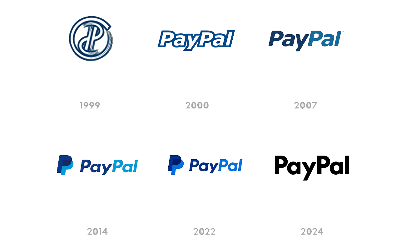
Since its 1999 debut, PayPal’s logo has gone through several iterations, each reflecting the digital era it lived in. The early marks leaned into the tech boom’s metallic gradients and italic slants, then evolved into a cleaner, more legible sans-serif in the mid-2000s. By 2014, PayPal adopted the double “P” symbol and brighter blues we’ve all come to recognize.


The Pentagram Update
Pentagram’s 2024 refresh aimed for restraint. They dialed back the gradients, flattened the forms, and introduced a solid black wordmark set in a geometric sans-serif. The new look aligns PayPal with the broader trend of minimalist, modernist tech rebrands—neutral, scalable, and unmistakably “safe.” While it succeeds in function, it feels like something else was lost along the way: personality. The sense of energy and motion that made PayPal feel fast, digital, and global got traded for something quieter.

Our (Very Quick) Take at Structure
We wanted to see what would happen if that sense of motion and confidence returned—without sacrificing modernity. So we reimagined the PayPal mark ourselves. Keep in mind we only spent about 2hrs on our process, purely for curiosity.
Our version keeps the iconic italic slant and dual “P” layering but introduces more depth and balance. The secondary “P” shifts backward and left, creating a natural sense of forward momentum and dimensionality. For the wordmark, we brought back the slant, color, and weight contrast, ensuring it feels dynamic again—alive in motion, just like the digital transactions it represents.


The Result
What emerges is a PayPal that feels current yet unmistakably PayPal. Confident, fluid, and distinct from the sea of grayscale tech logos that dominate today’s landscape. We adore Pentagram, and our concept isn’t about reinventing for reinvention’s sake—it’s about honoring legacy while pushing the brand forward with purpose. Because sometimes, what a brand really needs isn’t less personality—it’s more clarity about who it already is.

Written by Alex Cook,
Lead Director at Structure