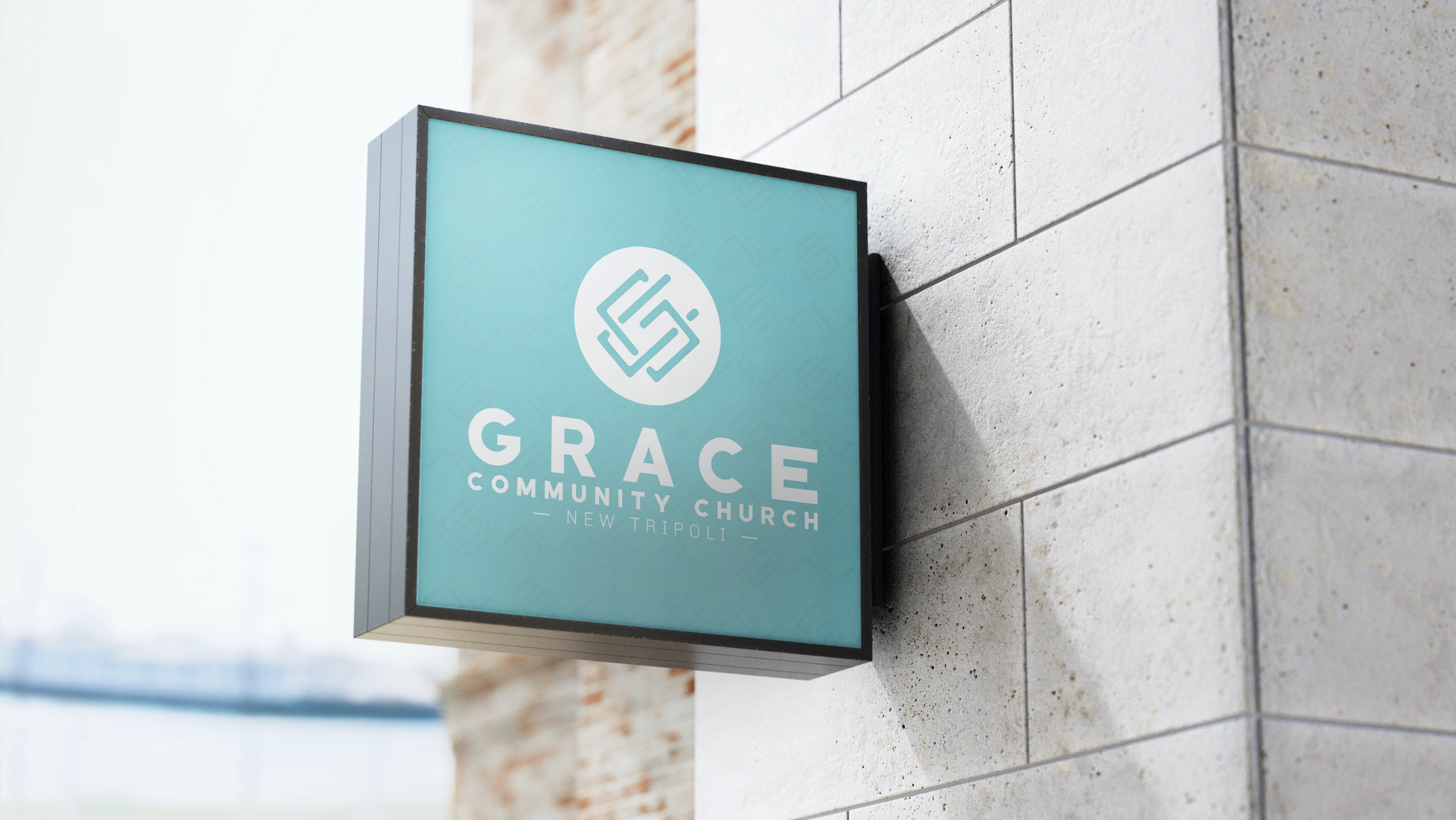
Giving a church new life to continue its mission.
Grace Community is a church in New Tripoli that has worked hard over the last few decades to spread the living word of Christ to the local community. When Sean, their new head Pastor joined the church, he quickly realized they needed to update the way the church presented itself in order to remain appealing to newcomers and younger adults.
Sean approached us and discussed their challenges, and it became apparent to us that a major part of their hardships were based on a lack of branding and an outdated identity. With “Grace Community Church” being a common church name - even locally - it also became clear their identity was lost in a sea of other institutes. We worked with them to build a clearly unique identity and brand ecosystem around it, to help them in their process of updating the church’s mission of staying current.
SCOPE OF SERVICES
• Brand Strategy
• Brand Development
• Identity Design
TIME SPENT ON PROJECT
• 2 Months

Their original identity.
Initial concept sketching.
StyleScapes for directional decision-making.

MORE THAN JUST A LOGO.
Grace Community Church’s logo has a lot of meaning within it. The final direction was a monogram consisting of a “G” and “C”. The clean and sleek feel of the interlocking letters nod to the future of the church, embracing change and modernity. The letters also link together, mimicking a chain with dual meaning: The breaking of chains from sin, but also the connectedness of the body of believers. Lastly, We tilted the entire monogram upwards 45°, not only giving it a slightly edgy and energetic appearance, but also representing that the church is always looking upward and forward to God’s glory.


Color palette
Pattern systems for collateral and applicable scenarios


