Helping a 50yr old career & tech school look back on its rich past, and welcome the future.
Lehigh Career & Technical Institute has been an established staple of an institute in the Lehigh Valley since its founding. They are one of the only schools in the country to offer some of the skills they house to students - both kids and adults. 2021 marked LCTI’s 50th year, and Structure helped develop a strong yet fun brand and identity for the anniversary.
SCOPE OF SERVICES
•Identity & Graphic Design
•Anniversary Brand Package
•Copywriting & Tagline Development
TIME SPENT ON PROJECT
•2 Months

THE STRATEGY
The 50th Anniversary is much more than an image: The brand is reflected in the organization’s mission, core values, dedication to students, advancement in learning, and strategic themes as communicated through all messaging and interactions.
MISSION
LCTI provides future-focused technical education to curious & eager students, partnering with other schools in a way that helps students succeed in their careers.
VISUAL VOICE
Minimal, clean, modern & playful.
STUDENT EXPERIENCE
Transformative, welcoming, comfortable & valued.
BRAND KEYWORDS
Future-focused, essential, connected, high-tech, resilient, innovative.
SUCCESS ENGINES
Awesome programs, dedicated teachers, cutting-edge equipment, real-world experience.


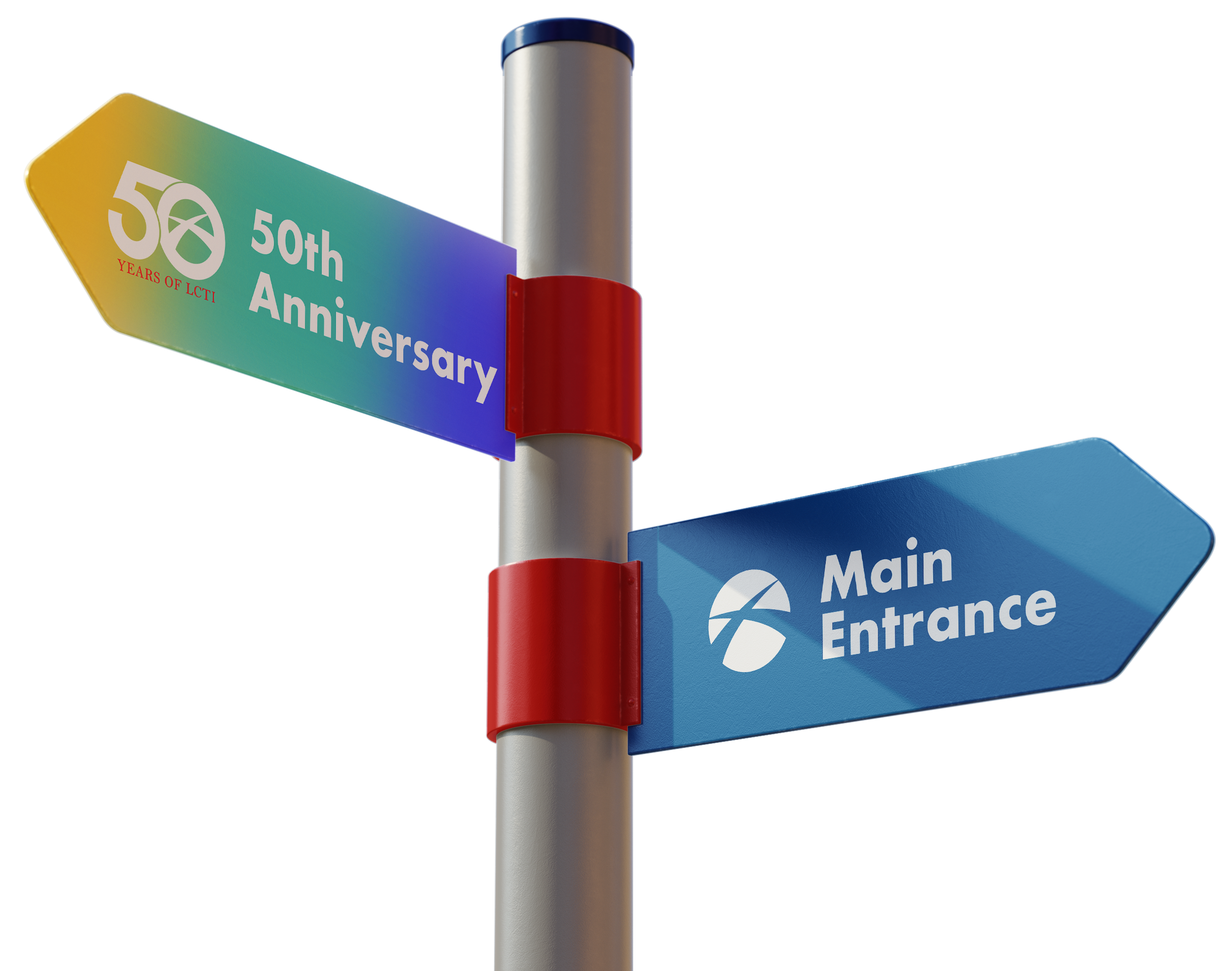
LCTI’s goal was to inwardly & externally reflect and look back on its rich past of success, covering the span of 50 years. The look was to feel professional and connected to its partners, while still exerting an energy of joy, playfulness and celebration.

Brand StyleScape Exploration


Looking back at LCTI’s 25th Anniversary, their presentation was formal and heavily type-driven. We opted to stay true to the type style of celebration, with the addition of playful colors and a marriage between sleek fonts and classic serif style. The original logo LCTI implemented is nearly the same as today’s iteration, with sans-serif sharp edges and minimal modernism. Creating a vintage looking identity for the 50th would appear misleading, while fully embracing modernism would lack respect towards the past. The solution was to develop a rich combination, honoring both the past and present, with excitement towards the future of LCTI.

Initial logo concepts based on strategy and discussion. LCTI opted to keep their mark within the 50th logo itself.

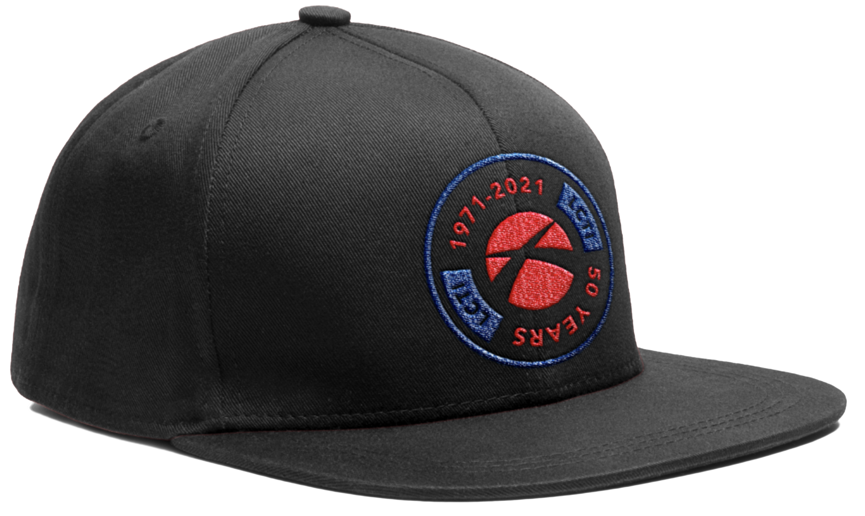
Final deliverables, from left to right: The 50th logo in anniversary colors, the 50th logo in LCTI’s standard brand colors, and LCTI’s 50th anniversary stamp logo for secondary purposes.


THE CHALLENGE:
Create a visual brand and identity for LCTI’s 50th Anniversary that did not stray too far from its primary branding, yet was easily identifiable and would receive praise by kids, parents, board members and partnering school districts.
THE OUTCOME:
The team’s aim was to develop an instantly recognizable, strong but playful anniversary brand with attention to LCTI’s main logo, plus fully integratable support assets to round out a balanced anniversary brand.


Color palette hierarchy.